Introduction
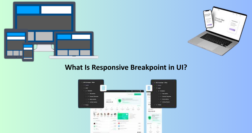
These days, users can access websites and applications from nearly anything-a desktop computer or even small smartphones or tablets. Because of this diversity in screen size, unique design challenges come into play: how can you organize an interface (UI) to look great and work well across devices? The solution lies in responsive design: adjustment of layouts and elements by the UI to various screen sizes and resolutions. The heart of a responsive design is a responsive breakpoint.
Responsive breakpoints are nothing but clauses that exist in a layout to define the change of a UI when viewed with a different size of viewport; usually, these breakpoints or points are different for every design. It is like having invisible triggers- cross the virtual borders, and the UI changes in terms of moving elements, reducing font sizes, depending on a high collapse method that changes an entire section. From personal blogs to enterprise dashboards or e-commerce sites, breakpoints have great significance in providing similar experiences across various screens for all visitors. This article explores responsive breakpoints, including their significance, effective use, and best practices for UI designers and developers.
Understanding the Basics of Responsive Breakpoints
What Are Breakpoints in UI Design?
Responsive breakpoints are concrete widths of screens that make websites or applications change their layout to look good for users.Subscription services should avail themselves for popular devices-such Pen and phone, laptop, and desktop. When these are reached, the UI determines whether it should allow new sets of CSS styles or layout rules to be implemented because of the changes in screen size. The types of media queries would typically be CSS because this is how developers have managed to apply different styles despite the width, height, orientation, or resolution.
For example, if one has a website with three columns on a desktop display, the same site might condense to have only two columns when viewed on a screen with a width of 1024px or lower. If that column falls down to a width below 768px, that content would become one column to read on any smartphones. It is these different points at which the website should put something on screen that would allow the content to be readable, navigable, and functional on any screen size. Otherwise, in such a situation, the users with smaller devices may have to zoom in or scroll too much instead leading to poor usability and high bounce rates.
The Purpose and Importance of Breakpoints
Responsive Breakpoint implementation seeks to enhance interface usability and visual integrity across devices. Without breakpoints, UIs would be ill-equipped to handle changes in their environment, leading to distorted layouts, text that became unreadable, and buttons far too small for users to press-almost exclusively on mobile screens. Simply put, breakpoints counter the items by dynamically altering the desktop interface according to various screen realestates to provide the best user experience possible under given circumstances. This is particularly important in a world with mobile-first design. There will be times when mobile traffic actually takes precedence over desktop traffic.
In addition, they are instrumental in enhancing accessibility and engagement: two critical factors determining user satisfaction and retention. A responsive layout that automatically adjusts according to screen size enables users to concentrate on content and inventions. This leads to increased on-site time, higher conversion rates, and improved aggregate performance metrics. For a built-in view, breakpoint implementation transcends mere whimsy-it becomes a strategic choice affecting user experience, brand perception, and perhaps even revenue.
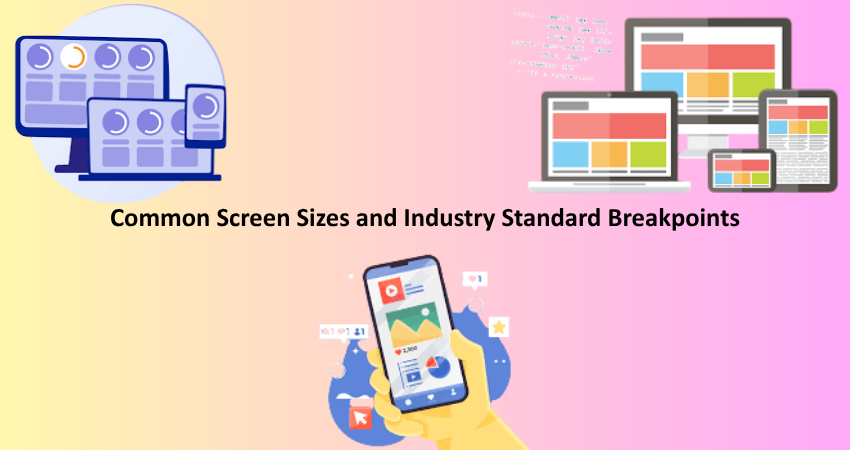
Common Screen Sizes and Industry Standard Breakpoints
Typical Breakpoint Ranges Used in UI Design
Personalizing breakpoints for responsiveness is not an exact science within itself, but there are some industry norms for typical device categories. Designers and developers across all models usually use breakpoints as widths such as 320px, 480px, 768px, 1024px, and 1280px because these ranges tend to cover a range of common smartphones, tablets, laptops, or desktop screens. For example, a 320px to 480px breakpoint might be used to target small mobile devices; 768px breaks for tablets, while anything 1024px is likely to be used for desktops or larger displays. These pre-defined gaps will usually promote shifting during layouts that reflect true worldly use.
In practice, multiple breakpoints may exist for a responsive UI to render in an optimal fashion. For example, a desktop would show inline links on the navbar (for viewports above 1024px), changing to a hamburger menu on tablets (between 768px and 1023px), while touch targets and font sizes would be further optimized on small phones (320px to 479px). Developers can create extra layout components for specific ranges as suitable and convenient for adaptation by referring to media delinquencies such as @media (max-width: 768px) or @media (min-width: 1024px). Such renovations in layout preparations provide designers with assurance that specific content would indeed display very well across the major classes of devices.
When and Why to Customize Breakpoints
Even though you can rely on industrial norms as a starting point, not every product or audience, will be fit well in these breaks. Customizing breakpoints according to analytic data, client demographics, or even UI components can sometimes be the best. For example, if analytics show that most users enter your site through a device that has a width of 375px, you might want to introduce a breakpoint at 375px for more accurate optimizing. Just like if a particular layout component starts breaking or looking quite awkward at 840px, this could call for an exception breakpoint without consideration of standards.
Custom breakpoints are also a great way to get the design right for contents-based layouts. They will not just concentrate on devices’ categories, but address breakpoints for contents. Therefore, such breakpoints are based on when the content is crowded and when it appears broken, irrespective of what the device uses. This type ensures that your design is fluid and adaptable, even though it has an innovative approach to screen sizes in the market. Essentially, you make custom breaks based on the visual breakage or user need as one of the strongest points you can think of in responsive design; it leaves you holding the cards as the designer himself.
How to Implement Responsive Breakpoints with CSS
Writing CSS Media Queries for Breakpoints
CSS media queries are the prime utility to help develop responsive designs with the use of breakpoints. Media queries allow you to change certain styles that will depend on the width, height, or orientation of a screen, as well as the capabilities of the device itself. A sample of a media query would be:
css
Copy
Edit
@media (max-width: 768px) {
nav ul {
flex-direction: column;
}
}
With this rule, one tells the browser at screens that are 768px or smaller to stack their navigation items vertically-over-breaking the navigation into columns rather than a horizontal setting. Use any combination of other styles for typography, spacing, layout grids, images, or components to ensure it looks good and works great throughout all devices.
Use min-width to style larger screens and max-width for smaller devices; and, of course, combining both with logical operators will give you an even finer level of specificity, for instance:
css
Copy
Edit
@media (min-width: 769px) and (max-width: 1024px) {
.sidebar {
display: none;
}
}
The ultimate flexibility for adjustment of each user interface component is offered by this approach. For improved maintainability, however, it would be better to adopt a mobile-first approach: style for the small screen first, and then add enhancements on larger screens using media queries with min-width. This structure goes well with today’s usage pattern and tends to result in cleaner code.
Tools and Frameworks That Help with Breakpoints
The investigation of practice on sources like media queries is therefore interesting; however, most of the time, designers and developers will choose to work more with frameworks and tools due to reasons related to time, utility, and pure choice. Frameworks like Bootstrap, Tailwind CSS, and Foundation provide built-in functionalities for working with layout breakpoints and responsive utilities to create responsive layouts without much CSS hassle. For example, Tailwind has a set of classes: sm:, md:, lg:, and xl: to invoke responsive styles based upon defined breakpoints. Such an abstraction tends to reinforce consistency across the project rather than requiring the designer to memorize arbitrary pixel values.
In contrast, Figma and Sketch allow UI designers to prototype and simulate how their layouts will behave at different breakpoints. Designers can map layouts’ response to different device sizes and confirm the look and feel of an interface even before a single line of code is written. Moreover, in the developer tools available in every major web browser-from Chrome and Firefox to Safari-these site respondent model simulators are used by developers to replicate the behavior of their UIs and fill specific widths. This is an excellent way to hone angles or edges and refine breakpoints from whom to appear for an apt experience by touch.
Best Practices for Using Responsive Breakpoints in UI
Designing Mobile-First and Enhancing for Larger Screens
Adapting design for mobile-first is one of the best ways to create a site. Start designing and coding your interface by enabling the design to appear at its smallest size and then progressively enhancing for bigger screens. In CSS, it means that you write your base styles to suit mobile users, and then your additional @media min-width: … queries for modifying those styles for tablets, laptops, and desktops. Not only does it keep your CSS structure much cleaner, but your UI will perform very well for the devices users access most frequently.
Adopting a mobile-first strategy leads you directly toward prioritizing the content and the use, for the need of careful design thinking in the smaller screens. For example, squeezing all navigation to the essentials, readability of fonts, and the number of touch-friendly buttons is what defines this space. After that, when the core mobile layout is built sturdy, a great deal can be added and diversity into the experience on bigger devices added by columns, adding hovers and animations, and all sorts of interactive effects. This layering handles scalability, so UIs evolve as devices are ever-changing. More importantly, it starts the way with a user inclusive experience.
Testing Breakpoints Across Real Devices
Breakpoint design is only useful if you pair it with the excellent testing of your UI on a variety of devices and screen sizes. Although there are responsive simulators in the browser developer tools, they never perfectly replicate real-world conditions. Therefore, it is very important to then also test on the real devices, especially those most commonly used by your audience. Because of pixel density, OS rendering engines, and hardware limitation variances, the behavior of smartphones, tablets, and several monitor sizes can differ.
Starting from identifying the most common screen sizes from analysis tools like Google Analytics, these breakpoints should undergo rigorous testing, keeping in mind layout shifting, navigation usability, and touch responsiveness. This phase focuses on finding tons of overlapping elements, inconsistent spacing, and text clipping. In the best-case scenario, diverse operating systems should be attempted like iOS and Android, as well as Windows and macOS, to catch as many edge cases as possible. Document the results for reference and amend the media queries, where needed. Testing also gives credibility to you being a designer or developer who’s passionate about user experience.
Conclusion
A true foundation of contemporary UI design, responsive breakpoints speak of the evolution from different sizes of device screens into a seamless user experience. So, designers and developers have vehicular leverage when crafting interface designs that maintain symbiosis in aesthetics and presentation across all different types of handhelds, tablets, laptops, and desktops. When you master the art of behavior of breakpoints, their timing of usage, and their implementation by CSS3 media queries, you will minimize your adaptive work.
Irrespective of being a portfolio in question, a commercial e-commerce application, or a SaaS dashboard, including responsive breaks enhances the seamless scaling of your interfaces and usability in every context. Your projects will gain fluency from best practices in mobile-first design, excessive testing, and the use of responsive frameworks”: Breakpoints are not only technical tools; they are decisions affecting how users will perceive and interact with your product. If you conquer breakpoints, you conquer the art of creating flexible and future-accommodating interfaces.