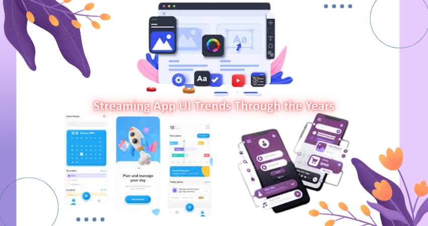
Introduction
Over the past few decades, the complete overhauling of people’s interaction with entertainment has changed from traditional broadcasting via television to digital streaming services. These are complemented by the advances in user interfaces (UI) in streaming applications that determine how people will use the content. These UIs have evolved from early bulky menus to slim, neural-intelligent interfaces. It morphed according to what technology, accessibility, and the demands of the user dictate at present. Visually and interactively, a streaming app typically serves as an initial interface by engaging and influencing the whole experience of a viewer. Amid an already crowded market and competition, streaming platforms dedicate an enormous investment in developing perfect UIs to ensnare-and-keep the audience glued.
From 2000 to the date of writing this article, a look into the major UI trends of streaming apps. Each phase of this evolution has been influenced by trends concerning device capabilities, design philosophies, and user behavior. By analyzing the various design shifts in time-from static grids and drop-down menus to dynamic interfaces with personalized content carousels-an understanding can be made of how user experience has matured in tandem with technology. The study also gives pointers on how future innovations could shape the coming era of UI design in streaming services.
The Early Days of Streaming Interfaces (2000s)
Static Layouts and Basic Grids
In the early 2000s, streaming platforms were just starting to get the hang of things. Streaming applications had user interfaces that were often clunky and static due to limited bandwidth and rudimentary Web technology. With no other major distractions, early streaming platforms favored really simple grid layouts in which the user would scroll across rows of titles with very little interactivity. Most early UIs were text-heavy menus and thumbnail previews that did not support high-resolution images or animations. Navigation was usually linear and restricted, reliant on cumbersome menu hierarchies and drop-down lists. It worked but simply lacked the beauty and accessibility of modern interfaces.
Such interfaces were indicative of the limited-technology environment. The screens had low resolutions, internet speed was sluggish, and users mainly relied on desktop browsers or set-top boxes for content. Buttons were chunky, fonts lacked inspiration, and very little importance was given to spatial design or visual storytelling. Interactions were minimum; features like search and recommendation were either non-existent or badly executed. Such elements were more reliable in content delivery than sophistication in experience. Hence, the earlier years of 2000s were identified with utilitarian – as foundation for the streaming platform UI evolution.
Menu-Driven Navigation and Limited Personalization
One of the chief characteristics of early streaming UIs was the usage of menu-driven navigation. Heavily inspired by DVD interfaces and early web portals, the users were often required to click through multiple menu layers simply to get to a genre or show. The absence of personalization meant that every user got to see the same homepage irrespective of their viewing behavior. The very generic nature of it certainly did little to engage the user, oftentimes making the content discovery process even longer.
On top of that, the absence of data analytics would mean that the early streaming platforms were not really able to customize recommendations significantly. No features like history of watched videos or suggestions along the lines of “because you watched” were available. It was entirely passive, with the user having to know beforehand what to watch. Without any intelligent navigation and visual cues to assist users, browsing could become quite tedious. It was, however, the time when a few seeds were sown for later innovations. The developers started to realize how important UX design is for retaining customers, and this understanding slowly led to the gradual infusion of smarter navigation attributes in subsequent UI generations.
The Rise of Smart Interfaces (2010s)
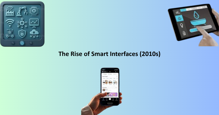
Content Carousels and Rich Visual Thumbnails
At the period between 2010, a time where technology ushered in a new dynamic visuality into UI design. High-resolution screens, fast internet, as well as strong devices enabled rich visual use by streaming platforms. Carousels have become a primary UI component that allows users to scroll through their customized collection in a horizontal manner from TV shows to movies. These carousels were filled with high-definition thumbnails that frequently contained motion previews and cover art, resulting in a more dynamic browsing experience. The entire transition from textual navigation to visual?some kind of wall-to-wall artistry! The face transformation of apps for streaming.
Such advancements enhance usability and discoverability. Icons helped users recognize content easily, reducing the effort involved in finding something interesting. At the same time, the hierarchy of these elements oriented the users through the app almost intuitively. As hover-over previews and micro-animations were integrated into the user experience, platforms such as Netflix and Hulu began their emphasis on immersion and convenience. Content started to feel alive, and the interface itself became a medium for storytelling. This visual dynamism was a stark departure from the utilitarian designs of the previous decade and made an entirely new standard for interaction and engagement.
Introduction of Personalized Recommendations
Although it had been a reality for quite some time before the 2010s, personalizing the recommendation of content became the UI innovation of the decade, being able to use big data and machine learning to analyze user behavior for making individualized home pages and recommendations for users on platforms for streaming. Basically static menus were practically far away from dynamic environments which formed themselves according to the user’s tastes. Algorithms captured the patterns in which content was viewed and made it possible to adjust placement as a function of those patterns, which appeared to encourage greater engagement and longer session duration. Personalized rows like “Because You Watched” or “Top Picks for You” quickly entered the vernacular.
This was a significant shift from the UI standpoint. It made the user experience go from one-size-fits-all to highly personalized. The homepage became a reflection of the user’s interests; having this content familiarized itself to be a more appealing reason to come back. UI designers had the challenge of showing a growing library of content while not overwhelming the user. To do this, they used card-based designs, infinite scrolls, and smart grouping. The interface, thus, would tread the fine line between being aesthetically pleasing and functionally deep so that users could discover new content while easily accessing their older favorites. Therefore, personalization became a key pillar of modern streaming UI design.
The Era of Cross-Platform Consistency (2020s)
Unified UI Across Devices and Platforms
With the proliferation of different devices on which users consume streaming content-smartphones, tablets, smart TVs, gaming consoles, and web browsers-the demand for the same UI experience increased. In the first decade of the new millennium on, however, real cross-platform UI standardization really started taking place. Streaming platforms are introducing responsive and adaptive design frameworks in an effort to ensure all users interact with their service in a seamless way, regardless of the size of the screen being viewed or the kind of input being used. Whether the user taps on the phone or clicks with a remote control, it is the same interface across different devices.
Cross-platform consistency meant a thoughtful systems design inclusive of modular components and scalable UI patterns. Unified frameworks with shared style guides, typography, and layout rules were developed by developers. The approach sought to improve usability by limiting cognitive load; in other words, users would not relearn interface when changing devices. Brand trust and user confidence were established by consistent iconography, layout logic and behavior patterns. Thus, a coherent experience in streaming became better and user-friendly, enabling users to pick it up at the last point of leaving it, irrespective of the device being used.
Voice Control and Remote-Friendly Interfaces
The world saw a dramatic increase in the technology of smart TVs and streaming devices, each releasing a new interaction model, either through its form of remote-based navigation or by voice command. The major players in streaming media distribution, meanwhile, adapted their user interface in support of voice search: Amazon Prime Video, Disney+, and Netflix made content discovery easier for users. Instead of having to type with a remote or navigate through sluggish on-screen keyboards, users could just tell the TV what to do: “Play Stranger Things” or “Show comedy movies.” This certainly increased both accessibility and usability of the experience.
Remote Accessibility Interfaces also followed suit, permitting directional navigations via a remote. The grid-based UIs were designed to be viewable where users could focus on them and left-right, up-down movement had been made easy. Button size, spacing, feedback animation, and such were accommodated to have the best television viewing experience. These changes were, to be sure, indicative of a major turnaround in the front-end design premises: mouse and touch input were relegated to second place in the designers’ minds as they now began to seriously consider voice, gestures, and very limited-button remotes. This newly defined territory was embraced by front-end developers whose successful delivery of these systems across many environments further drove home how central the UI is for the memory edges of great user experience design.
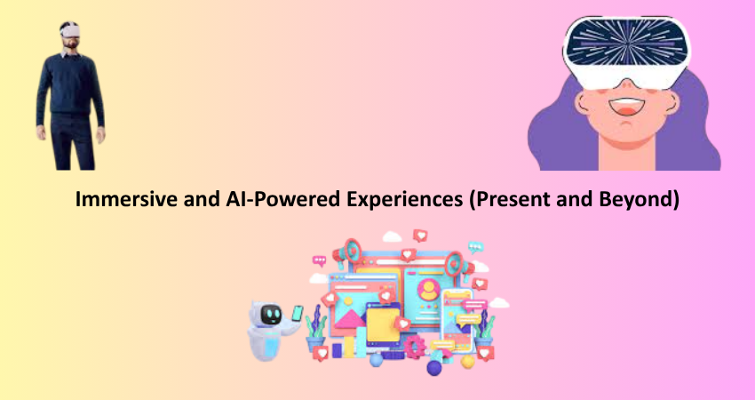
Immersive and AI-Powered Experiences (Present and Beyond)
AI-Driven Content Discovery and Smart Layouts
Streaming apps are now quite smart and predictive all because of advances in AI and machine learning. Almost all screens today have a life of their own; they move beyond reacting to user input to predicting user needs. The AI engine analyzes a variety of data, including watch time, pause time, genre preferences, and even interaction histories. With this information, we can personalize the layout so that relevant content is appropriately displayed according to user habits and moods. Consequently, a dynamic content carousel engages not only with what users like, but also when they prefer to see it.
Brilliant UI, making for an efficient and engaging experience, thrives on excising infinite scroll pages from the user experience, opening a gateway to relevant content. Some platforms even engage in mood-based suggestions or hour-of-the-day theming: Chill Evening Picks, for instance, or Quick Lunch Break Episodes. From a UI perspective, it contextualizes this with more personalization, becoming more alive and human. These advancements ensure the UI can become more than a static shell; instead, it evolves into a living and responding ecosystem that is influenced by user behavior.
Immersive UX with AR, VR, and Interactive Storytelling
Streaming UIans in future will have immersive user experiences in terms of processorization via things like augmented reality, virtual reality, and even interactive storytelling. At the trial level, specialized companies are venturing into creating VR cinemas, AR-enhanced interfaces, and engaging storytelling where the user drives the storyline in real time. All these developments herald the frontier to be cracked by user interface designers: multisensory, participatory environments beyond just sitting watching.
Front-end engineers are among the frontline elements in this scenario, and they carry an errand of integrating immersion features, yet with usability on a practical ground. The contextual information about characters might be in the form of AR overlays, while event streaming might use a full-range VR event environment. Similarly, interactive stories will expect interfaces that would allow the decision to flow with the narrative without interruptions. Such demands push UI design into a hybridity where all the storytelling, interaction, and technology must find common ground. Emerging from the mainstream, yet the trend is so clear: streaming UI of the future will be interactive, immersive, and most of all, personalized.
Conclusion
Streaming application UIs have undergone transformation from the static, menu-driven UI of the early 2000s to today’s intelligent and immersive interfaces; reflecting on a larger technological and cultural backdrop. With each time period came advances in usability, accessibility, and engagement, leading to a shift in the way one discovers and consumes digital content. While the first feature of video playback was simple, the technology has developed into sophisticated interfaces that respond with user’s preferences providing a custom-tailored experience across devices.
However, despite the reign of streaming in the global entertainment realm, UI design should be at the core of customer satisfaction with the brand’s compelling differentiation. AI, AR, and VR are positioned to once again redefine our interaction with digital media. Developers, designers, and companies should keep their finger on the pulse of UI trends, since the features offered become a point of distinction in what is one increasingly crowded and competitive market. Evolution of the UI is not merely a matter of design-it is rather a means to create lasting bonds between people and the stories that they cherish.