Introduction
Building a portfolio is one of the most important tasks your portfolio will show other people, potential customers, or potential employers. The portfolio is often the only point of access that you will have for clients or employers for you to understand the details regarding your skills, creativity, and problems that may come up in your process or work. Though many little mistakes, sometimes even from rookie designers who have more talent and passion than skill completely ruin their portfolios because these mistakes can make the best designs look really unprofessional or give that impression of a failure to understand the core fundamentals of user experience and interface principles. Understanding what these mistakes are and how to avoid them could just make that portfolio have the edge you need to make it in this highly competitive industry.
This article will discuss general rookie UI/UX mistakes that ruin how the portfolio is perceived. Such mistakes will be described under different headings, with detailed discussion and use cases for fixing them. Pitfalls range from lack of case study storytelling to a poor visual hierarchy to overlooking accessibility; these can form strong impressions of how recruiters, clients, and peers view one’s capabilities. In learning to detect and remedy these issues, you will make a portfolio that speaks of not only design talent but also understands best practices for user empathy and detail- intricacies, which one requires to be in UX/UI design.
Weak Case Study Storytelling
Lack of Clear Problem Definition
Failure to articulate the case-studies problem is a very well-known mistake in junior designers’ portfolios. How can viewers know the context of all decisions made in the design? Normally, junior designers present wireframes, mockups or final interfaces before talking about what challenge or opportunity the project sought to solve. When this information gets missing, the evaluator finding it difficult to assess whether the designer possesses any kind of strategic thought in work. The portfolio itself is a narrative and laying the foundation is significant in any fine tale. To set the stage has, of course, a purpose, that being the client, users, and a particular pain point. Without any of this context, the design process can appear quite superficial, almost looking like mere screen decoration as opposed to a real solution to a concrete problem.
Also, without defining the problem, there comes the possibility of not knowing how to measure success. Designing is not just about making something pretty; it is really about resolving problems that enhance user experience, meet business objectives, or deal with usability concerns. In case studies that do not establish a problem, the viewer wonders how your design decisions relate to the needs of users or the objectives of the project. They cannot see your reasoning or value addition to your work. Beginning designers can greatly improve their portfolios if they take time to articulate thoughtful well-structured problem statements at the beginning of their case studies. This helps contextualize the work and gives you the opportunity to demonstrate analytical skills alongside your creative ones.
Skipping the Design Process
Another mistake that most beginners make is omitting the design process in their case studies. A portfolio that merely exhibits stiff-walled polished UI screens and which does not provide any design evolution can easily lead an onlooker to guess that he/she is dealing with a designer who thinks alone and lacks an iterative mindset. They want to see the path or journey you took to arrive at those solutions. Did you do any user research? What insights did you gain? How did those insights go on to inform your wireframes, prototypes, or user flows? Leaving out such points weakens your portfolio but also denies you a chance to showcase crucial design skills such as empathy toward users, testing, and problem-solving.
Not including the design processes almost proves to be belittling to your own work. Without sketches, wireframes, iterations, or a user feedback loop, it may appear as if your design decisions were arbitrary as opposed to evidence-informed ones. Such a reputation could be unfavorable, especially in the UX/UI space, where data-driven decision-making and iterative testing are core values. A good portfolio showcases as much the journey behind the design work as it does the end result. By explaining what challenges you faced, how you validated your ideas, and how you then enhanced your work based on feedback, you are basically showing thoughtful consideration through the complexities of solving problems. Such storytelling will win over the audience and give them that extra confidence in your ability to make significant contributions to their projects.
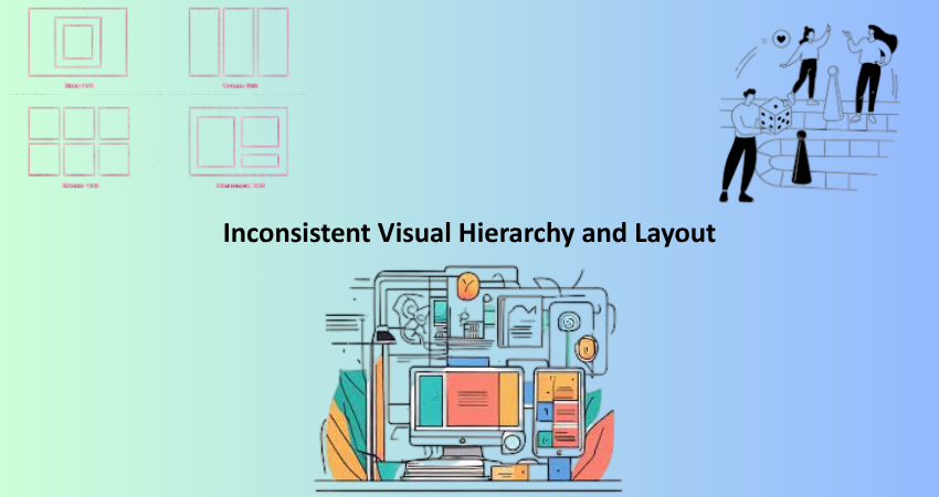
Inconsistent Visual Hierarchy and Layout
Misuse of Typography and Spacing
A stronger and more mature portfolio will include a demonstration of a designer’s understanding of visual hierarchy, and yet most young designers massively underestimate such aspects as typography and spacing in achieving this. Lousy font selections, misused heading sizes, evening the random use of bold and italics will render a portfolio most chaotic and most likely amateurish. Just like inconsistent or cramped spacing between elements, it will be more challenging to write around and about the contents when the viewers skim through your work to get an overview. Visual hierarchy guides the viewer’s eye through the presented content in a logical order; otherwise, poorly managed typography and spacing lead to confusion and present an unpleasing visual clash that distracts from the quality of even the best work.
Misusage of the typography and spacing does much more than ecstasy and really sends signals about your comprehension of the interface design principles. Your portfolio lacks even the very basics of readability. Perhaps then it makes one speculate about your capabilities in designing user-friendly applications. Well, these are the businesses that have some doubts on whether you will apply the same practices to their products. Instead, use clear and specific terminology to effect the outcome in which intentional typography and spacing design is rhythmic, structural, or focused. With a clear hierarchy between headers and body text as well as proper breathing space around elements, viewers can effortlessly scan through the designs and absorb the key messages while appreciating the design for aesthetics without any unnecessary distraction.
Poor Alignment and Grid Usage
Another thing that afflicts most rookie portfolios and really makes things really worse for them is poor alignment with the absence of grids. Grids and alignment create the very foundation of a harmonic balance layout, with a very professional and easy-to-move-in atmosphere. For instance, when some elements of the page are simply placed without being aligned properly, or have margins and padding that are inconsistent, it gives rise to a very disorganized and raw look. In fact, a lot of times, junior designers either do not use grids or do not make grids rightly, but instead make lay-out pages messy by having awkward white space and disjointed visual flow. This lack of precision does not just ruin the overall aesthetic of a portfolio; it also suggests that very little attention is paid to detail, something that all hiring managers find suspect.
An understanding of good alignment and grids goes beyond hierarchy and creating beautiful versus functional work. When your portfolio is grid-oriented, it feels deliberately organized and shows that you are designing interfaces that feel cohesive and intuitive for the user. Gridding helps ensure some conformity between various pages and sections of your portfolio, reinforcing a sense of unity in the whole presentation. A strong grip on these principles will dramatically enhance the professional image of any junior designer’s portfolio, while winning the trust of the viewers, who expect UX/UI work to be executed with precision.
Ignoring Accessibility Best Practices
Overlooking Color Contrast
In contemporary UX/UI designing, accessibility is an accepted part of it all; however, at most, rookie designers overlook this aspect while putting their latest portfolios together. One of the major accessibility no-no’s is poor color contrast. If no contrast exists between the text and background colors, users with visual impairments, including color blindness or low vision, will find it hard to read. This impediment will render a portfolio greatly unreadable or annoying for a large section of its audience, as far as hurling an insult or two against them. Apart from offending any potential client or employer with their own accessibility needs, this blunder speaks volumes about the designer’s lack of familiarity with inclusive design principles, which have found special significance in the technology industry by the day.
Adverse color contrast is not only a usability barrier, but also it is one of the unquestionable proofs of an entire misunderstanding of the very role that the designer plays in creating equitable digital experiences. Contrast failures would not be easily forgotten by recruiters and clients telling them that the designer has probably not given enough attention to accessibility in their project work. It is important to test your portfolio with the contrast checking tools and to use guidelines such as Web Content Accessibility Guidelines (WCAG) to get rid of this rookie error. Good contrast does not mean compromising on an aesthetic vision; on the contrary, it often helps in making things more readable and giving your design a cleaner, sharper feel. Deliberate color choices demonstrate skills in design and empathy for the user.
Missing Keyboard and Screen Reader Support
Another rookie UX/UI mistake that can compromise with an impression on your portfolio is forgetting to verify that your site works well with keyboard navigation and screen readers. Many designers are so caught up in the visual representation of their portfolios that they forget all users will not interact with the content in the same way. The portfolio that either cannot be navigated with a keyboard or read by assistive technologies creates huge barriers for the users with disabilities. Such oversight depletes the accessibility of your portfolio and does poorly for your image as a designer regarding inclusive design principles. Instead, a portfolio which works for everyone would convey potential employers and clients that you’re a designer thinking of the entire range of user needs.
Setting keyboard and screen reader support into the portfolio might appear to be a massive task initially, but it surely improves the user experience for all users. Using semantic HTML with a proper ARIA label and keeping in mind that interactive things like buttons and links should be keyboard accessible are easy steps that can be taken to greatly improve accessibility. Incorporating these considerations in your designs shows that you are a designer who knows that UX/UI is beyond aesthetics-it’s about functional and inclusive experiences. In addition, when the portfolio has such a design, it can set you apart from other candidates who may have not placed so much importance to it.
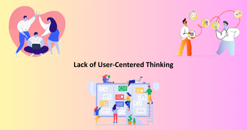
Lack of User-Centered Thinking
Designing for Yourself, Not the User
Also, another rookie mistake that usually puts a dent in UX/UI portfolios is the tendency of designers to focus more on their own tastes rather than on the needs of the end-user. An urge to design based on aesthetics or unique layouts that the designer feels are exciting or appealing is something that designers usually feel, especially perhaps at the very beginning of their careers. Nevertheless, UX/UI is not about the designer’s own preference; it is about solving real problems for real users. If portfolio works are heavy on glitz and flair, interesting animation, unconventional navigation, or overly artistic interfaces that can never pass usability tests or politely frustrate the user, then that just indicates that there exists a gap in the understanding of what true user-centered design is. Employers and clients want to know that your work was built under empathy and endorsed with user feedback over following personal whims.
Failing to involve users often leads to failure, especially where usability testing is ignored altogether. So, while designs might visually impress in a portfolio, they may fall apart in practice if they don’t meet user expectations and behavior patterns. The absolute rookie would, of course, be one who sets out on the track of pure aesthetic innovation without any sign of user validation. This is very easy to spot and shows that he is completely disconnected from the core of UX/UI. It gives an authentic reason for the creativity in the context of user-oriented solutions and its use of examples to show user-centered design and iterated testing processes. Discussing these will convince a viewer that you consider the user’s experience above all else, which indeed separates great practitioners from those just performing therapy.
Ignoring Context of Use
Another beginner error concerns designing interfaces in a vacuum and not thinking about the context in which they will be used. This context can define the physical environment (e.g. is this product used outdoors in bright light or indoors at a desk?) or the emotional and cognitive state of the user (e.g. are they hurrying, stressed, or multitasking?). Not only should the designer speak to these real-world factors in the portfolio, but they should also convey an understanding that their problems could be less solved when put into practice. For instance, a designer may design a beautiful dark mode UI, but if their portfolio does not mention how that design fares in bright daylight or when viewed on old devices with subdued display brightness, it really signals ignorance about practical usability issues.
If one ignores the context of use, he/she misses, among other opportunities, the chance to emphasize design choices that impress employers and clients. Context-sensitive design would include designing for low-bandwidth scenarios, designing with mobile interaction foremost in mind, and investigating differing cultural perceptions associated with icons and colors. When fledgling designers ignore these details in their portfolios, they lose an important opportunity to show their strategic thinking and ability to anticipate user needs in the real world. Discussing context of use in your case studies—explaining how you adapted design for particular scenarios or environments—can be a huge portfolio boost and firmly position you as a designer with a bird’s eye view.
Conclusion
An UX/UI portfolio is beyond a gallery of fancy screens or a visual résumé-it reflects how you really think, solve problems, and care for users. Rookie mistakes have been common, but they can have serious impacts on the perception of your portfolio or whether it throws open the doors of opportunities for you in the design industry. Poor case study narrating, visual-hierarchy inconsistency, ignoring accessibility best-practice and failure to apply user-centered thinking are just some of the traps where your portfolio can get hurt. Not only do these things affect how stunning your presentation is; they show major gaps in understanding the core principles of UX/UI and even lack attention to detail, both qualities which potential employers and clients want from a designer.
Fortunately, all of them rookie mistakes could be wholly amendable by consideration and exercise. Identifying problems clearly, demonstrating your design process for solving them, using consistent visual hierarchies, thinking about context of use, and prioritizing accessibility would all transform your portfolio from simply a collection of work into a power tool to emphasize your strengths and professionalism. A good portfolio doesn’t only demonstrate skills but tells an interesting story about how any designer thinks about design, demonstrates empathy for users, and commits to building meaningful experiences. With all possible competitions in the field, these rookie errors can give you the edge to survive.