
Apart from being a visible part of UI designs, color serves as a powerful means to communicate behavioral guidance to users, invoke emotions and ensure usability throughout the experience. A sound color system is capable of integrating different design elements, communicating the brand and enhancing the interaction that users have with that design. Using colors presupposes something practical going beyond choosing coincidental shades on a color wheel; it involves the study of color theory, accessibility, cultural connotation, and system scalability.
This article is about simplicity in color systems within user interfaces. It will deal with color theory, color spaces, the formation of big palettes, their application in where a color role is meant to be used; their accessibility, as well as cultural and psychological factors to keep in mind when creating color systems. The goal of this guide would be to make you competent and structured enough towards creating thought-through, effective, and inclusive color systems for digital products.
The Foundation of Color Theory in UI Design
Understanding Hue, Saturation, and Brightness
Color Theory considers three elements of color: hue, saturation, and brightness, and the act of mastering them. Hue can be described as the color family itself, like red, blue, green, etc. Saturation is a measure of the intensity of that hue, while brightness (or value) describes the degree to which a color appears light or dark. These three properties serve as a base for how color is perceived and used in UI. When properly balanced, the three elements build a soothing interface, aesthetically pleasing yet functionally convincing. Brightness and saturation can be manipulated to establish a clear visual hierarchy or a differentiation between active and inactive states.
The contrast and visual interests thus created with the help of these elements are often manipulated consciously by designers. Bright colors, with high saturation, may be reserved for calls to action and warnings, while muted colors may be assigned to background or secondary elements. By consciously controlling hue, saturation, and brightness, you cue the user to focus, navigate, and interact in an intuitive fashion. This becomes all the more crucial in interfaces where complex workflows or thick information architecture are involved. With an elementary knowledge of color theory, designers can retain clarity and cohesion across their designs.
Color Harmony and Contrast Principles
Creating appealing and beautiful color schemes involves aesthetics in art, in the sense of harmony and contrast. Harmony deals with colors that go well together and do not cause undue strain to the eye. Designing color schemes such as complementary: opposite on the color wheel; analogous: next to one another; or triadic: all equidistant from each other around the wheel comes into play during the design of harmonious palettes. Such ordering yields a conscious and intentional selection of colors that remain aesthetically endowed but do not impair usability. Harmony is not sameness; rather, it is a purposeful interaction of colors that work together as a visual flow.
On the other hand, contrast draws the eye while improving her legibility. Icons and UI components must stand out distinctly against their backgrounds. Insufficient contrast makes it difficult for the user to read or find important elements. However, too much contrast can overwhelm and distract. Balance between harmony and contrast is required to keep a design’s focus on the user. Strong contrast provides necessary accessibility for users with visual impairments, allowing them to confidently navigate and interact with the interface.
Color Spaces and Digital Display Considerations
RGB vs. HEX vs. HSL: Choosing the Right Format
When delving into digital color, designers meet different formats; the most used are RGB, HEX, and HSL. RGB stands for Red, Green, and Blue-the primary colors of light. It defines color values on a 0-to-255 range and is extensively used in design software and web development. HEX is the hexadecimal notation matching the RGB values, mainly in HTML and CSS. While serving similar purposes, HEX codes are considered more compact and easier to work with in a web-based environment.
HSL stands for Hue, Saturation, and Lightness, providing an even easier approach to altering color. Instead of attempting to remember arbitrary RGB values, designers can increase or decrease hue by some degrees, saturation by some percentage, and lightness by some amount to generate variations of the color systematically. This is especially useful for producing color scales and meeting accessibility requirements. What would determine which representational systems to take would be purely a function of the task being performed; for example, developers would tend to work with HEX or RGB while designers might prefer HSL as it gives better control and easier manipulation during this designing phase.
Display Calibration and Device Variability
The color rendering of devices can vary considerably due to various conditions such as calibration for the screen, brightness settings, and panel technology. A color can look highly bright on a high-end monitor and can look quite dull on a monitor considered to be of very low quality. Thus, designers need to test color systems on different devices and different screens. Design tokens and platform previews go a long way toward achieving this consistency, but manual testing is still the king. Colors must not only be tested in static mocks but also really in connection with the actual interaction behavior.
Simultaneously, ambient light and other viewing conditions vary the perception of color. For instance, the user could be accessing the app in broad daylight or a dark room-those situations are dramatically altering color perception. Therefore, light and dark mode support these conditions. When designers create color systems, these dynamic use cases must fall under consideration so that the interface carried out stays consistent and usable under any device or environmental factor. Such a level of detail increases user trust and the quality of the interaction.
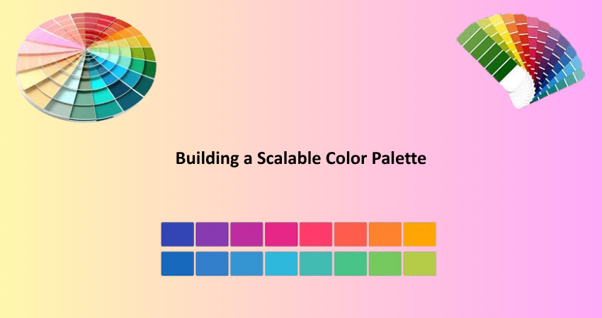
Building a Scalable Color Palette
Defining Core, Neutral, and Functional Colors
There lies strong foundational colors system forwarded by three categories such as core color, neutral color, and functional color. Core colors are sometimes brand or product focused colors that make up most of the visual identity pertaining to the product. The colors often tend to be the ones that users identify or associate with your application or organization. Neutral colors are other colors like gray, white, and black, which are used for backgrounds, borders, and dividers to add certain structure while ensuring that the interface does not look too visually busy. Functional colors have system states such as success (green), error (red), warning (yellow), and information (blue).
If these categories are clearly defined, you are bound to be consistent and scalable across your interface. Each category is defined based on a number of shades to meet various levels of emphasis and hierarchy. For instance, core colors might be light, base, or dark while neutral tones might range from soft background grays to bold black for text. A structured methodology takes away guesswork and makes for better design system update and maintenance.
Creating Color Scales and Tokens
Such definitions enable the designers to develop their own color scales for each shade of color in the color system. The color scales consist of a series of tints and shades (generally from 100 to 900) to refine the application of otherwise unrestricted levels of color to particular components in a UI. A scale of blue primary might go like this: Blue100 would be the lightest version, and Blue900 would be the darkest. These scales allow depth, contrast, and responsiveness. Furthermore, they aid in defining the visual hierarchy, whereby lighter tones may be applied to the background and darker ones to text or important elements.
To apply these scales, many teams resort to using design tokens that are named variables which keep and capture visual properties like color, space, and typography. Amongst other advantages, these avoid discrepancies in using color across multi-platforms. They serve in fact as a single source of truth for both developer and designer, making updates easy and inconsistent status unlikely due to shifts or errors in memory. Tokens go with really any storage type-whether it be Figma, Storybook, or code repository, they help translate design decisions for scalable and maintainable systems.
Accessibility and Color Contrast in UI
Meeting WCAG Guidelines for Readability
In UI design, accessibility is not an option but a requirement. There are the Web Content Accessibility Guidelines (WCAG) that set standards to govern the usability of the interfaces for people with visual impairments, color blindness, and other disabilities. This brings us to color contrast! The WCAG dictates that normal text should possess at least a 4.5:1 contrast ratio against whatever background it is placed, while large text should possess a minimum ratio of 3:1. These measures will ensure that all users can easily distinguish between foreground and background elements, facilitating reading and reducing cognitive load.
Endless options are available to test for contrast, like the Stark plugin, WebAIM for contrast checks, or Figma-built accessibility tools. The UI states that must also be tested in order to remain compliant are hover, focus, disabled, and active states. Accessibility ought to be built into the color system from the get-go instead of being appended later on. This way, you ensure that your design is not just broader in reach but is also compliant with the law in many countries.
Designing for Color Vision Deficiencies
The critical view of color vision deficiencies is more apparent than realistic, as it is affecting many men compared to women, that is 8% compared to 0.5%. The most common kinds of such disorders are deuteranopia, protanopia, and tritanopia. The first two primarily deal with reds and greens, while the last one pertains mostly to blue color. When an individual looks at a display that carries information with color only, this will be difficult for him under those conditions. For this reason, inclusion of some other cue as a label in the text, with icons, or some kinds of pattern will be required to form an understanding. For example, applying color together with a specific other indication like a symbol to signify the particular error state could enhance access.
Simulating color vision deficiencies during the design will find problematic areas at the earliest possible moment. Such tools include Sim Daltonism and Adobe Color’s accessibility checker, which simulate the various types of color vision. It is going to not only market very large and wider user base but also be ethical being registered into the intake. In fact, incorporating accessibility within the color system allows one to think about some interfaces in which all users will be supported and welcome.
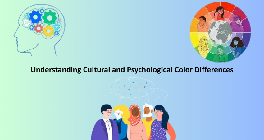
Understanding Cultural and Psychological Color Differences
How Cultural Context Influences Color Meaning
Color perceptions and understanding differ significantly, and this makes a tough call between UI designing of an application that goes worldwide. For instance, while a red color would reflect urgency or danger in the western cultures, it also translates into luck in many Asian cultures. To ensure that a user feels at home with an interface; cultural sensitivities are needed to be taken into consideration and effects may misjudge glaring symbols of a culture, leading to user discomfort or even rejection from said product, especially for branding, CTAs, or warning systems. A good market research on cultural orientation of your audience is, therefore, necessary in the establishment of a color system for a global user interface.
The colors so applied can also intimate culturally sensitive elements such as various holidays, traditional attire, or even political affiliations. As opposed to that, saffron is spiritually very significant in countries such as India, while in America, it does not bear the same weight. Such associations framework user expectations and determine how their visual design is understood and interpreted. An accepted color in a region may come across as highly offensive or inappropriate in another area. Adaptive design principles may shape the UIs for multilingual or international audiences, such that the color palette changes according to user location or language selection. Imagine the harmony and relevance of color.
Psychological Responses to Color in UI Interactions
The psychology of color plays a vital part in the way users emotionally respond to a digital interface. Each color may evoke a psychological cue: for example, blue, generally associated with trust and stability, is a favorite in finance and healthcare. Meanwhile, orange resonates with enthusiasm and creativity, so you’ll generally find it on call-to-action buttons or entertainment apps. These associations give an understanding that can be translated into actionable designs that can direct user behavior and emotional reaction through visual cues. Color, in practical terms, can bring in users, inspire them with confidence in your design, and even add up to the final numbers of your conversion rates when applied well in a design system.
Context and hierarchy also change emotional triggers. For instance, a notification badge highlighted with red may have incited urgency or alarm to encourage immediate response. Excess use of that red color, however, may start to either overwhelm or stress users, contributing to high bounce rates. Designers must also consider how the emotional connotation of a color may alter with a change in repetition, saturation, or even layout. A well-executed UI design will turn the psychology of color use to the advantage of user intent, task difficulty, and greater emotional climate of the user experience.
Conclusion
In effect, this is the secret that a designer must have for mastery; the coloristic systems as foundation skills. Color theory, application of color spaces, palettes that aid in accessibility and branding- each one of these will form an experience that is cohesive and pleasing to the visitor. Time spent mastering these principles will teach designers how to craft interfaces that not only look good but also involve function, inclusion, and emotive connection.
Color systems must, therefore, adapt to research-based and thoughtful implementation as ever-new digital experiences continue to change across devices, demographics, and global cultures. By treating the psychological along with the cultural implications with good grounding in technique, one could create inering systems of color and relish clarity, usability, and delight at every point. Indeed, to wield color with great effect will always remain a distinguishing mark for really conscious UI designs that have a strong ear to the ground.