Introduction
The empty spaces around and between elements in user interface (UI) design are termed white spaces or negative spaces. White space may be a term that novices often take for granted; in actuality, white space is an essential element of UI design. It is not only a design aspect; it is also a functional aspect, providing ways to enhance readability, draw attention, and instill a sense of order. When utilized intentionally, the advantageous effects of white space will improve the user experience by directing attention and alleviating cognitive load.
Understanding white space contributes toward crafting interfaces that look good and can be used effectively. The right amount of white space improves an overall hierarchy and balance of a layout so that the user can seamlessly operate a digital product. In this cluttered world brimming with information and content, white space is the breathing room that enables a user to absorb what he is looking at. This article will discuss the principles and application of white space to usability in a UI layout, analyzing in-depth its practical benefits for both designers and users.
Visual Hierarchy and Focus
Guiding User Attention
White space is significant to create visual hierarchy that helps to direct the gaze of the user toward important interface elements. In UI design, not all content is given equal importance, and white space is the tool that a designer has to guide the focus of users toward what they really want them to see. One example is putting space around a CTA so that it draws extra attention and will, therefore, entice user interaction. This technique minimizes the need for heavy colors or graphic emphasis; rather, it uses spatial positioning for clarity.
Additionally, white space serves to remove clutter from the interface so that users are not overwhelmed with visual noise. By setting one element apart from another and giving space around them, designers define paths for the eye to trace. This ultimately speeds up the scanning process, allowing users to readily locate information. If too maddened together, the elements confuse users, separating sections, which furthers their frustration. Therefore, not only does white space add to the functionality but improves the flow of an active user experience, working as an unnoticeable yet heavy-handed guide.
Creating a Sense of Priority
White space, in addition to its attention-drawing capacities, also contributes to an understanding of the relative importance of different elements on a page. Giving primary content areas more space while giving secondary ones less space provides visual cues for designers in alerting users toward immediate focus. For instance, the homepage hero section would have ample padding and line height, conveying immediate importance, while the relatively more disgusting footer links would perhaps attract less attention. Our use of white space is the application of its much-prized principle: visual economy, paying attention to really important stuff while putting distraction on the back burner.
Deliberate spacing aids task completion via reduced interface ambiguity: users know where to look and what to do next and are likely to accomplish their tasks efficiently. This translates into useful interfaces, which translate into user confidence-building, especially in complex setups or data-heavy dashboards. White space puts breaks in your interface, thus avoiding fatigue. It does the same for transitions between content areas. Giving meaning to the allocation of space is how designers make interfaces more straightforward and user-friendly.
Readability and Comprehension
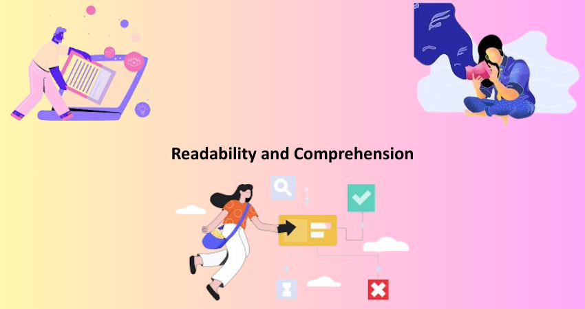
Enhancing Text Legibility
Text in digital interfaces is a predominant form of communication, and it is here that white space plays a major role in making the text easily legible. Adequate line height (leading), letter spacing (tracking) and padding around the text blocks prove further significant for legibility. Text which is scrunched into very tight spaces can usually become difficult to scan or absorb. This is especially true for small screens. White space, therefore, gives the eyes ample room to naturally move along the lines of text, reducing strain while improving overall readability.
Research has shown that increasing the space between lines of text can raise comprehension rates by as much as a surprising 20%. Those well-crafted spaces in their lines are vital access environments because they benefit users with low vision or other reading difficulties. Designers keep the breathing space for text so that it is not only available but also accessible. That means whether you have a paragraph in a blog post or you have put labels in a form field, white space around any text enhances usability by creating easy clarity and reducing visual clutter.
Structuring Content for Better Understanding
From legibility, the white space puts a big difference in the organization of content. Designers use this factor to push related items close together and separate unrelated ones, creating sections that aid perception of the information. In this way, spatial arrangement helps the user build a mental model of the interface, thus increasing ease in the location of targeted data or features. For example, spacing between sections of a form can actually help users in the traversal of a multi-step process since it lowers cognitive load and input errors.
Consistent spacing creates a visual rhythm concerning the layout and user expectations. When a user sees an even gap between heads and content blocks, they understand immediately the layout structure and flow of the specific page. Thus, the element of consistency helps in navigation and understanding, notwithstanding the other familiar user interface conventions. White space then becomes a structural instrument to help the user in interpreting complex content without being overly reliant on various other visual clues. It ensures that the information architecture is more digestible for end users.
Aesthetic Appeal and Emotional Impact
Creating a Clean and Professional Look
Immaculate white space adorning an interface is a true professional touch. In minimalist designs, white space signifies clarity, quality, and modernity. For example, Apple and Google are brands that celebrate elegance and simplicity: white space confirms their brand identity and builds trust. An airy, spacious layout indicates a well-thought-out design process, which indirectly promotes a good user perception.
When an interface looks packed with design elements, the users generally feel that it is out-of-date and hard to use. An interface that embraces generous white space will certainly have a feel-good factor. Users will confidently navigate through content without the fear of being swamped. The aesthetic charm of white space is more than just fancy; it is what creates the overall atmosphere of interaction, making it more likely for users to notice and interact with the content or services being offered.
Evoking Emotional Responses
Beyond aesthetics, white space affects users emotionally. Just as music uses silence to construct rhythm and drama, white space establishes spacing and feeling for the visual experience. Usually, wide-open spaces invoke calmness and serenity, while tighter configurations create an atmosphere of tension and urgency. A designer can use the ability of white space to stir emotions to reinforce the interface with the desired response from the user. For example, white space will be abundant in a mental wellness app to create a sense of relaxation, while a news site might consider more compact layouts to induce urgency.
The emotional dimension of white space is particularly relevant for interfaces striving for long-lasting engagement or loyalty. Users are more likely to come back to a site or app they felt comfortable and in control in. White space contributes to the alleviation of decision fatigue by doling out information incrementally rather than all at once. It engenders emotional clarity by providing isolated focus on things needing attention and damping down visual distractions that might evoke stress or confusion. Unobtrusive usability therefore becomes part of user satisfaction, hence the retention of users.
Functional Applications in UI Design

Navigation and Interaction Design
Conversely, white space bears relevance to navigation and interaction design in a functional way. It defines where things can be clicked, such as clickable areas or simple boundaries-the smaller the margin of error, the better, white space being an ally. A good design that gives the padding space for buttons means they will gain more real estate for touch purposes, especially for touchscreen devices. White space differentiates interactive objects such as links from dropdowns and thus prevents possible user errors. When properly used, it also helps in channeling the user’s attention throughout the interface with affordances and an intuitive navigation path.
And there’s white space supporting the notion of affordance-the apparent way users can know how the object should be used. Then these buttons, icons, and input fields look more sensible and fit together when separated properly by space. This reduces friction on the interaction and leads to a happy and smooth user journey. Clean interfaces that employ white space to accentuate interaction boost users’ ability to approach the product and execute actions with little or no impediment with a beam of confidence.
Responsiveness and Device Adaptability
With users accessing content from various devices, from desktops to smartphones, white space has become considerably critical. Registers of responsive design directly interact with flexible spacing to allow graceful adjustment of layouts to different screen sizes. Adequate white space prevents cramping of content on small screens and holds the visual weight on large screens. These areas allow for the buffer zones required for fluid layouts to ensure cohesion across devices.
Designers mostly use relative units (like percentages or viewport widths) and media queries to adjust white space dynamically. This way, usability is preserved without compromising aesthetics. The sidebar working principles would even fold into a drop-down menu on mobile, but have sufficient white space around its elements for tapping targets and readability. Given the right application of white space, it becomes functional from one device to another in making the process accessible and easy for the user to use the design regardless of the selected platform.
Conclusion
Literally empty space on a screen, space is actually an important user-centred aspect of usability in itself. It controls attention, aids readability, manipulates emotions and facilitates practical interactions. White space does all this silently but effectively in UI layout design and makes haphazard interfaces transform into clean and self-explanatory experiences. All the structure required for further clarity in communication with users.
With designers striving toward more accommodating, attractive, and efficient digital products white space will become a necessary use, not just a best practice. It creates a better perception of, greater engagement with, and enrichment from digital interfaces. As such, white space is no empty space at all-it is precision, clarity, and intention as tools for elevating form and, as much as possible, function in contemporary user interfaces.