Introduction
In the realm of competitive digital marketing and web designing, even the smallest visual aspects can wield a very strong influence over user behavior. One of them that has nearly worked miracles is the color of an Action icon, also known as a Call-to-Action (CTA), button. Color influences and makes user interaction into conversions. For example, “Buy Now,” “Sign Up,” or “Learn More”; the much-adored appeal CTA button pivotally stands in the life journey of the user. Its effectiveness depends on more than just placement or copy—it must be visually alluring, especially in its color. Just being extremely aesthetically pleasing, the color of the CTA button plays a decisive role in bringing about an entire set of psychological responses, attention draw, and guidance over decision-making processes.
Most businesses spend hours on perfecting their messaging and layout but they never realize their smaller things like the button color can greatly affect their performance. The right CTA color can, indeed, change the user experience so much that it would be the difference between converting and bouncing. The button color design decision is both an art and science-from the color theory to A/B testing results. This article will deal with the psychology of color perception, empirical research, best practices, and how to determine the best CTA colors for your campaign to help improve your conversions based on your brand, audience, and context.
The Psychology of Color in User Behavior
Understanding How Colors Influence Emotions
The background of color working as an attribute affecting human perception constitutes one of the most documented behavioral phenomena studied by psychologists. In the digital medium, these colors do not merely beautify; they communicate. Each color presents a different emotional experience, attracting or repelling users into action or inaction. For instance, anger-inducing red appears urgently stimulating action, hence its frequent use for “Buy Now” buttons. Trusting and reliable blue is used for those services that must earn credibility—banking or software platforms. Such emotional triggering affects subconscious decision-making, making it likely for users to take an action—or not.
Emotions and feelings caused by colors hinges on individual experiences, cultural backgrounds, or even gender. For instance, while in some contexts, green means “go” or may be related to something eco-friendly, in other contexts, it indulges an entirely different connotation. The nuances of color choices make CTA design frustrating yet tactically beneficial. A greater understanding of color choices psychologically allows designers and marketers to create CTAs based on their brand messages and the emotional expectations of their target audience. Be it confidence, urgency, or excitement, the right choice of color will help prepare users for conversion before even glancing at the relevant CTA text.
How Perception Shapes Action
Visual cues most determine much of perception, and the color element is one important aspect of this interaction. Immediately on landing at a site, the user’s eyes are drawn towards those visual elements that starkly contrast the rest of the interface. For example, an eye-catching button that is easily recognized against the site background may only be perceived if the offer is sufficiently interesting. But, a bright button would find its way straight into a user’s attention and easily motivate action. This is not just about looks but functional visibility. Minutes after a brief glance, users will judge. Depending on the context, the effect can signify importance, urgency, or safety by the color of a CTA button.
Expectancy and perception are further affected by the experiences that a user had in the past. If a visitor has come across multiple green buttons for confirmation, he would be found to rely more or click on green CTAs. In the same way, if he has previously associated red with error or warning, he would hesitate or not push a red color on a primary CTA. This implies that color must not only be chosen for the means of general psychological traits, but also be based on the users’ own habits and behavior. How colors are perceived often determines trust, urgency, and, even credibility; and all of them provoke the expected conversion path of a user.
Popular CTA Button Colors and Their Impact
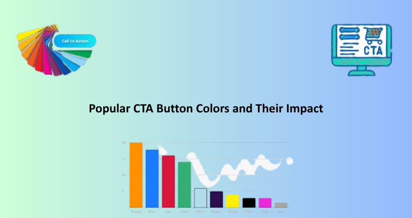
Red, Green, and Blue: The Classic Trio
Colors for CTA buttons are widely used red, green and blue; colors that correlate with emotion and behavior. Red may be the most aggressive and attention-obsessed color. It has intense emotions associated with excitement, urgency, and passion, making it especially useful for sales. Research has proven that red CTAs can drastically increase click rates for those offers that need to inspire some urgency, such as limited-time promotions or flash sales. Red, however, should be used with caution. In some contexts-say finance or medicine-it might evoke a more alarming or threatening perception rather than engaging.
In contrast, green usually stands for growth, harmony, and reassurance; it is the preferred color in situations where a user is meant to feel secure or in control, such as during checkout or registration processes. Many SaaS companies opt for those green buttons asking users to ‘Start Free Trial’ or ‘Subscribe.’ This color works exceptionally well with clean, minimalistic designs where it pops but does not overwhelm. Blue, on the other hand, is liked by all demographics. Trust, professionalism, security: these are the characteristics conveyed through blue, being the color of choice for brands associated with tech, healthcare, and banking. While blue CTAs might lack urgency, they inspire trust and draw the customer in for the long haul.
Orange, Yellow, and Black: Bold but Risky
There are much bolder color choices beyond the safer options-orange, yellow, and black. The psychology of color can work quite strongly. But they must be used thoughtfully to be effective. Orange is lively, energetic, and warm, particularly turning heads in the areas of youth or online shopping where approachability and dynamism need an extra push. Amazon is one such case by making its “Add to Cart” button orange. Quite simply, everyone sees it and feels it. The problem with orange-does-not fight against any other design element, in that it can quickly become too “bright and cartoonish.”
While yellow is merry and attention-grabbing, it is tricky to get right. It indicates optimism and cheeriness, but if used inappropriately, it may connote warning or caution. Yellow CTAs should work well for announcing special occasions, but readability and accessibility should be of major concern, especially when text is involved. Meanwhile, the black buttons connote sophistication and exclusivity and are good for luxury markets or minimalist designs that need contrast without adding distracting visual noise. But then again, black is a color that users may not introspectively associate with action unless the surrounding design context has directed them to that conclusion. Each of these colors may improve conversion rates in the right scenario but will detrimentally affect the user experience when misapplied.
A/B Testing for CTA Color Effectiveness
Setting Up a Proper Experiment
Theories and psychological assumptions regarding color will take you only so far. To know what works best for your audience, A/B testing is exactly what you need. A/B testing, or split testing, is showing two or more variants of a CTA button, each with a different colour, to different user groups. From the different metrics like click-through rate, bounce rate and conversion rate, you can find out which version works best in real-world conditions. Effective A/B testing relies on isolating variables; if you are testing button color, do not change the text, placement, or size at the same time, so that any performance changes can be solely attributed to color.
Apart from this, test durations and sample sizes are very important in yielding results that can be attributed to chance. Tests must last long enough to allow sufficient collection of users of diverse time-of-day, day-of-week use-cases. Further, you should ensure an even traffic split between versions and that external factors, such as the promotion mentioned above or spikes in traffic, do not skew results. Google Optimize, VWO, or Optimizely makes it easy to implement A/B tests on CTA buttons for teams without technical resource availability, as testing takes care of the needs of your data and leaves actionability based on what’s happening with your users.
Interpreting and Applying Test Results
Once your A/B test is over, you will need to analyze the results and put them to work. It is not really just about which color “won.” The deeper investigation is about why that color won and how it integrates into the larger user experience. A 10% increase in conversion from a green button as compared to a blue one suggests that when people see green, they feel more comfortable or inclined to take an action. The question, however, is: would that happen on every page or only selected touchpoints? Would that also happen with mobile players, view from several dimensions: Pure numbers and patterns of behavior should also join forces into this analysis.
Such successful alterations also need to be applied consistently across site or app so that visual and behavioral coherence is maintained. So if the product page shows that the green CTA converts, it is worth testing the same color in other areas of the funnel such as checkout or contact forms. However, it must be remembered that user preference changes over time and thus continuous testing should be done for optimization. A/B testing is definitely not a single event scenario but is actually an ongoing improvement process. Continuous systematic testing and iteration on your CTA button colors will then make your choices rely more on data and significantly boost their potential to improve conversion metrics over time.
Best Practices for Choosing the Right CTA Color
Aligning with Brand Identity
The main consideration while choosing a CTA color is brand conformity. The CTA button should stand out without compromising visual consistency with your brand. It may be thought that a bright red would attract clicks, but if the branding is based on calm earth tones, it is likely to clash and confuse. Brand identity is not limited to colors. Brand tone, personality, and values reflect their identity. CTA colors should only support that identity. Take, for instance, a luxurious black-and-gold brand for which a white or gold CTA button makes more sense than a neon green one.
It builds trust consistency across all touchpoints. Users will have their brand images and more cohesive user journeys when they find familiar color schemes in e-mail, landing pages, and checkout flows. You will want to optimize your call-to-action colors for accessibility, though. Readable text and visible buttons will also be important for users with color blindness or low vision. Tools such as WebAIM and contrast ratio checkers will help you ensure that the CTA is beautifully concise: Your endpoints indeed may have the same color as your brand, but should not blend in or be unnoticed; it can be a bit loud and bright, but it should look like an integral part of “using” your brand.
Leveraging Contrast and Placement
Inevitably, juxtaposition and site placement are just as important as color choice in maximizing effectiveness out of CTAs. An exceptionally brilliant button will lose all potency if it doesn’t create high contrast against its backdrop or happens to be placed somewhere crowded and non-intuitive. It is clear how contrast helps visibility but also directs the user’s eye to where it must go action-wise. A light background might engulf even the yellow button that would pop much better against a dark one. This hierarchy should set the CTA as the most noticeable thing without displacing the rest of the design. Aesthetics thus obtain but add usability across devices and screen sizes.
Placement is also hugely significant in this regard. Users generally tend to scan a page in an F-pattern: top to the left, right, then down. If CTAs are placed along this very natural line of vision, they will be more likely to get clicked on. Good placement and contrasting colors are a winning combo. And please, do try to avoid mixing multiple fun-colored CTA buttons within a single page context unless you really are distinguishing the primary versus secondary action clearly. Too many choices—or colors—can only add to user confusion, diminishing the impact. Simple, clear, and deliberate colors and layouts tend to be more engaging and yield higher conversions.
Conclusion
The color of your CTA button is more than an aesthetic proposition; it is a strategic negotiation that works with user perceptions, emotional response, and finally, your conversion rate. While no color is a guaranteed winning color, understanding the psychology behind color, performing good old-fashioned A/B tests, and sticking to your brand will help you in making informed and, consequently, effective choices. Red may create a sense of urgency; green may radiate confidence; blue may elicit trust. However, the exact color you choose for your brand is dependent on who your audience is, what your goals are, and what design context you are working in.
Like doors to action, CTA buttons attract more consideration in their design than any other aspect of the digital experience. This can be translated to mean that a smooth design, one characterized by contrast and accessibility, strategically placed, and rigorously tested, will create the best-performing CTA buttons. In tandem with the changing behaviors of users, so should your button colors strategy. In the end, for the most successful-the ones that use psychology, data, and design to usher users toward conversion with minimal stress.