Introduction
Typography is not merely the art of choosing typefaces; rather, it gets into the order, the hierarchy, and the clarity of text. One vital yet often neglected element of good typography in UI design is typographic rhythm. Perhaps akin to music rhythm, typographic rhythm ensures a smooth flow of content that is intuitive and pleasant to the eyes. Typographic rhythm sets up a rational structure for vertical space amongst text elements: headings, paragraphs, and captions, naturally guiding the user’s eye across the interface. If done right, it enhances reading, usability, and a clean and polished look for digital designs.
There is a huge increase in the complexity of digital content in the present-day world, and this Digital content can easily be understood only if designers have a proper rhythm in their typography. Lack of rhythm will only give disjointed layouts into readers’ heads, possible cognitive overload, and maybe frustration. On the contrary, clear and continuous rhythms provide seamless consumption of content and a professional visual hierarchy. This article will mainly talk about the various principles of typographic rhythm, covering aspects such as line height, spacing, modular scales, as well as baseline grids. We will also discuss best practices for movement across devices and how it all relates to an effective design system in interface architecture.
Understanding the Basics of Typographic Rhythm
What Is Typographic Rhythm and Why Does It Matter?
That would be typographical rhythm—well-defined regularity in any spacing between text elements: lines, paragraphs, blocks of content, things all work together to make a pleasing visual flow. In other words, it’d make reading as easy as listening to a well-written melody. Otherwise, and poorly, the layout becomes chaotic and content difficult to read. Good planned rhythm provides visual hierarchy and readability through well-balanced white space and text to lead the user naturally from one piece of information to the next. For such types of interfaces offloading content on digits, rhythm helps the user process information in chunks while retaining focus and memory.
Rhythm affects communication and interaction of a UI with its users in a crucial way. Rhythm affects engagement, navigation, and even brand perception. Visually distracting noise occurs when varying text elements follow inconsistent spacing and line-height; this interrupts the user experience. When typographic rhythm is applied correctly, it brings order to the page, contributes to readability, and offers well-managed consistency across all visual elements. This instills confidence among users and presents otherwise complicated information in a neat and easily digestible format.
Key Components That Shape Typographic Rhythm
Components of line height, font size, and the absence of spacing units deliver effective typing rhythm. The leading relates to the distance between lines of type. Good line heights typically give the text some breathing room without impairing legibility, i.e. line heights give room to the text and improve-readable conditions between 1.4 and 1.6 times the letter size. Font size creates differences in scale from modular numbers between headers, body, and labels. A modular scale unifies proportion among text units. Hence, maintaining a constant rhythm throughout makes it convenient to scan the content.
Margins and padding are spacing units that also affect rhythm since they regulate white space around and within content blocks. Spacing is set up on a defined grid, e.g. 8px or 10px system; this yields a common standard, giving an almost predictable rhythm to line it up nicely on different screens. These factors need to be synchronized; a mismatch of just one can lead to the entire flow being disrupted. It is, therefore, crucial that form and function be balanced with these components as part of a broader system that emphasizes good user interface design, but most importantly, enables good clarity, accessibility, and performance.
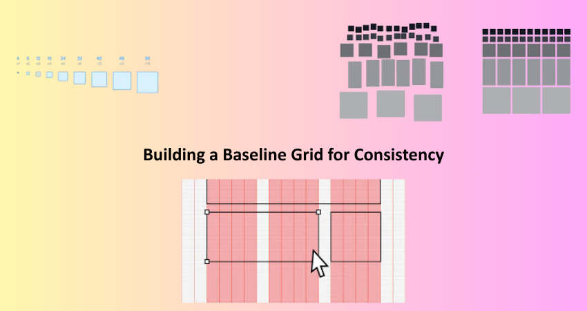
Building a Baseline Grid for Consistency
How to Create and Use a Baseline Grid
The baseline grid serves as an alignment system: it comprises evenly spaced horizontal lines along which text aligns. Thus ensuring vertical consistency within UIs, the baseline grid acts to position heads, paragraphs, and images with utmost precision; it will take charge of their awkwardly placed alignments. To establish a baseline grid, it is usually a value of either 4px, 8px, or 10px. Once a value has been determined, all vertical spacing and heights of the elements must be a multiple of that value. This technique locks all content into a predictable rhythm, allowing users to read and interact without having to make much visual effort. Although there are grid overlays in Figma and Sketch for keeping this baseline in the design creation process.
Aside from text clarity, a baseline grid significantly contributes towards cohesion for the whole interface. Especially, it works well with responsive designs, where alignment becomes more crucial as layouts change from screen size to screen size. In rhythm, however, the well-being of every visual element that might interfere with the baseline must be considered: icons or images. Designers should make certain that even these non-text elements comply with the work at hand and contribute to the flow. Thus, a baseline grid becomes the concrete of a UI’s rhythm that provides not only the visual appeal but also clarity in usage.
Aligning Type to the Grid Across Devices
Perhaps the most tricky consideration in responsive design is typographic rhythm across devices. What may look lovely on the desktop might feel crouched or off-balance on the mobile device. For better alignment, designers should be aware of relative units versus fixed pixels, converting to using metrics such as em, rem, or percent. Relative units allow text size-to-scale on the basis of screen size and parent containers, maintaining proportionality between text and its surroundings. Media queries and fluid typography can actively adapt modular scales and line spacing so that rhythm is kept intact across different viewports.
Another aspect is to create an arrangement or utilize utility frameworks where the pre-defined spacing and typography values are tied into a grid. These systems can centrally delineate all breakpoints, font sizes, and spacing ratios, thereby enforcing an easy rhythmic consistency in any type of layout. Check that the rhythm doesn’t break across different resolutions by testing across multiple devices. Thus, through responsive baseline grids and flexible design principles, visual integrity is sustained while readability remains unharmed, irrespective of any form of interaction by users with the product.
Establishing Hierarchy Through Typographic Scale
Using Modular Scales to Define Typographic Hierarchy
A modular typographic scale is the series of font sizes calculated by either a consistent ratio of 1.25 or with 1.618, which is the Fibonaccian or golden ratio. So, in this case, a base size like 16 px gets multiplied by this ratio to enable designers to calculate appropriate sizes for all headings, subheadings, and body text. This equates to visual consistency in terms of clarity that allows for easy recognition of different levels of content by readers. In essence, UI layouts featuring modular scales help balance elements and support an intuitive content hierarchy.
The application of a modular scale also helps define its line heights and spacing rules. For example, larger headings might need larger line-heights or more margins so as to maintain rhythm. By measuring space and scale using the same scale, designers relax sudden jumps in text hierarchy and maintain visual smoothness for the interface. Modular scales also make handoffs to developers easier since values follow a logical progression, allowing these to be reused throughout the system, enhancing consistency and productivity.
Enhancing Readability Through Hierarchical Spacing
Spacing will not be less important than the sizes proportionate to typographic elements. Margins, padding, and line heights clearly demarcate the different areas concerning hierarchical spacing, allowing users to move along the content naturally. For example, larger spaces between sections and their sub-contents signal a change in topic/intent. User will be able to absorb information without confusion by creating the spatial rhythm, with every block of information given its visual weight and space to stand out.
Designers must use spacing based on some common unit, like 8px or 10px, multiplied as much as needed to show separating elements for content. Along with it, the text lines and spacing should also be based on a common rhythm, like a baseline grid, so that nothing can turn out to be misaligned or jarring. Spacing does wonders like good aesthetics; it becomes an ally for accessibility as well, creating the content scannable to users who find visual or cognitive impairments. Architecture style gives well-defined quite readable options and creates a feeling of inclusiveness to user experience from the start to finish.
Applying Rhythm to Real-World UI Scenarios

Typography Rhythm in Navigation Menus and Headers
Menu bar and header navigation panels are significant components of most UIs, and consideration given to typographic rhythm is an added usability and aesthetic benefit. Usually, nagging text has short links, titles, or call-to-action phrases; however, their placement and spacing in this context can heavily perhaps affect the user’s perception of the actual site structure. The rhythmic placement will help impart the correct amount of space around each item, marrying it with the significant vertical and horizontal grid of the rest of the page. This alignment creates a sleek interface, which helps users to recognize divisions, navigate easily, and predict the content flow.
Designers can maintain rhythm in Navarro with the choice of font sizes that adhere to the same modular scale present across the layout and by maintaining padding and margins that remain consistent. A global baseline grid can help even a compact menu align with the rest of the typography. For instance, the horizontal spacing between menu items should mimic the rhythm set in the vertical spacing of the content areas. Similarly, the spacing between the logo, the main navigation, and secondary text elements (i.e., login links or icons) should fall in cadence with the established vertical rhythm in the content section. This allows the header to feel connected rather than disconnected from the remainder of the UI.
Typographic Rhythm in Forms and Input Fields
Another area where typographic rhythm greatly influences user experience is in forms. Labels, placeholders, help texts, and buttons should all work in unison; anything else will spoil usability and visual clarity. With poor vertical alignment or spacing, users will start questioning how the structure of the form works or what is expected of them in their input. If the rhythm is effectively implemented, the form will seem inviting and natural to navigate. It also works as an accessibility aid by creating a predictable layout and spacing rules for screen readers and keyboard use.
Designers have been called upon to use rhythm within forms because text-based components are supposed to be aligned with the baseline grid: labels, fields, and instructions in their unit measures. Input field heights must be set to meter with the beat established by the line height of body text, such that transitions from content to form appear as visually seamless. Above fields, label spacing uses consistent units of spacing, and help text should be strategically positioned just below fields, affording it adequate breathing space. Button text should follow the same modular scale and spacing as used on the rest of the layout, thus ensuring continuity. Forms are easier to scan and complete and do not frustrate users or lead to higher conversion rates like all components that rhythmically align the forms.
Conclusion
Thus, typographic rhythm brings balance, clarity, and professionalism to UI layout. It draws a messy cluster of textual material into an experience guiding users effortlessly through information. By mastering rhythms through modular scales, baseline grids, line heights, and spacing rules, designers are enabled to create interfaces beautiful but extremely functional. They ensure that every heading, paragraph, and label is working together, creating a harmonious user experience.
It’s not an accident that good rhythm happens-it is the result of deliberate precision and consistency in decision-making. Be it a blog, dashboard, or mobile app, rhythm aids in clarity and retention. So while today’s interfaces do start to do more for the user, tipping the scales in favor of an increasingly essential place for structured and rhythmic typography, it is worth embracing. It’s typography rhythm: design intention-where every pixel counts toward usability, accessibility, and visual excellence with text.