
Introduction
User experience (UX) and user interface (UI) design form two of the most important pillars for creating those digital products that individuals fall in love with. Though often mentioned in conjunction with each other, UX focuses on the journey and experience of that user, and UI refers to how the product interface looks and feels. For the novices entering the design field, mastering UX and UI can sometimes seem like an insurmountable task. But the beauty is that you definitely don’t have to be a senior designer with years of experience to begin making intelligent design decisions for users.
This guide presents practical, useful, working pieces of UX/UI knowledge designed for beginners and the recently initiated. After having dealt with a website, mobile app, or software interface, you will literally be trying these in real-world scenarios and thus forcing them to work for you. We will discuss essential concepts: usability, consistency, accessibility, strategies for layout, and user feedback-with stepwise reasoning and examples you can immediately start using.
Focus on Simplicity and Clarity
Start with One Goal Per Screen or Page
This is one of the most common mistakes made by most new users when they begin using UX/UI designing, i.e. going right away into multi-tasking. When a page portrays more than one goal, the user may not understand where to look, what to do, or what is more important as to what they should focus on. Hence that is why the principle of “one goal per screen” is such a powerful starting point. This is the very thing that dictates every design choice made: the outcome it is meant to create for a certain screen-with, for example, signing up or reading an article or buying something. Your layout becomes purposeful and your interface more intuitive by referring to a focused goal.
So on a landing page for a product, the main goal could be for users to hit the “Buy Now” button. Everything—the visuals, the text, the colors, the layout—should really guide the user toward that action without anything else to compete with it. If you’re trying to get them to subscribe to your newsletter, explore your blog, and follow your social media all at the same time, you simply are going to confuse the experience and drop conversions. A beginner must sketch or wireframe every single screen with only that main objective. It’ll become more complex later but has to be clear first. Always ask, “Is this page trying to do too many things at once?”
Prioritize Visual Hierarchy and Readability
To form visually what you mean, you need to also include a design such that the said purpose shines through in visual hierarchy. Visual hierarchy is the way in which elements are arrived at such that it is clear that some of the elements are more important than others. Examples of such elements are the use of different sizes for various elements, coloring and spacing, alignment, and even typography. A beginner does not know that just using a large, dark button can draw more attention than smaller CTAs hidden in much white space or clutter. Actually, even white space found around a large, dark CTA button can make his diminutive cousin pulling clicks in the wrong place feel pretty useless.
The contrast is the answer to making reading possible and organizing it. Give titles large, bold lettering; subtitles-treated slightly smaller letters; texts and body complaints with possibly easily parsed letters (at least 16px). Limited but highly contrasting blue and white text and background effect will give a good color palette. Guide by means of space and layout, probably share similar content in creating space. If you are still unsure if your hierarchy gets heard or not, try squinting at the screen—whatever is noticeable ends up being first to catch a user’s view. Hierarchy does not only mean having fancy tools and equipment but also includes mindfulness and restriction. Make your UI clean, as users will appreciate that.
Design for the User, Not for Yourself
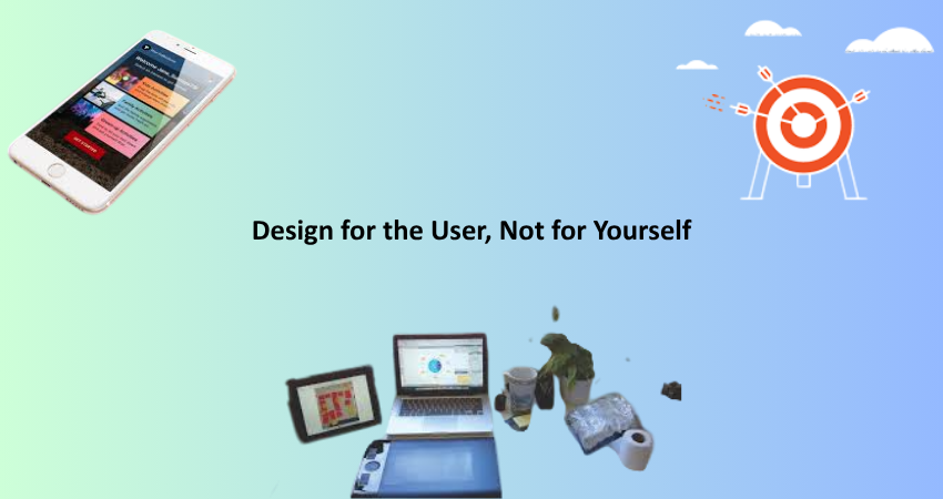
Empathize With Real Users and Their Needs
Empathy is the basic foundation of UX, and that means standing in the shoes of the user. It is easy, as a newbie, to fall into the trap of designing things that look cool or match one’s own style without thinking of whoever else will use them. Effective UX/UI design begins by understanding the people who will interface with your product. What do they want? What frustrates them? In what context will they be using your interface? Every decision must be made to benefit them, not you.
To eyewitness-and-empathetic design, start with basic user research. You don’t need to have a big budget or have advanced ways to talk to real end users about their experiences. Simple surveys or interviews might reveal amazing insights into someone else’s use of your product. To you it’s so obvious; on them, this might be a confusion. For example, a button may just seem like “Start” to some, while others might think this will initiate a tutorial; this may trigger the whole product. Thus, understanding your audience better will improve the effectiveness and intuitiveness of your design decisions.
Test Your Design Decisions Early and Often
One of the best pieces of UX advice for newbie upfront is: Don’t guess- test. It can be tempting to ‘know what’s best for users’ after having slaved for hours over a design. In fact, assumptions are more likely to lead to disgruntled users. Testing your designs may not necessarily mean a full usability study; it could be about inviting a friend to try out your prototype and then watching where they gets stuck or what happens when they try to do a task. At the end of the day, early feedback saves time and expense in the long gone construction of flawed experiences.
Do things like creating fast prototypes with tools like Figma, Adobe XD or even paper sketches of your interfaces and ask people to perform certain tasks using the design, say signing up or searching for a specific piece of information. Watch how they do it with no hints. Where do they hesitate? What confuses them? These are the areas you need to improve on. Being a starter it’s perhaps scary to show that work before it’s ‘perfect’ but getting real-time feedback early on is one of those fastest ways to grow as a UX/UI designer.
Make Navigation Intuitive and Predictable
Stick to Familiar Patterns and Conventions
The moment a user comes on a website or into an application, he or she carries with them a lifetime of experience and expectations. They know where menus typically go; they know what certain icons mean; they know how to click buttons and fill out forms. As a new designer yourself, it can sometimes feel compelling to try something avant-garde or artistic-but artists who change common patterns are often met with mystification. The best UX/UI advice here is not to surprise your users. Familiarity breeds comfort; comfort holds attention.
Standard navigation conventions exist for a reason. For instance, most users expect to click the logo to be sent back to the homepage. They expect the menu icon, or the “hamburger,” to be located at the top-left or top-right corner. They understand underlined blue text means it’s a hyperlink. By sticking to these patterns, you allow the users to not consciously think, just act. This lowers cognitive loads and raises usability. You may have room for visual creativity, but make sure that its function remains predictable. When it comes to navigation design, usability will always be favored over originality.
Keep Menus and Links Clear, Concise, and Organized
It helps build a well-organized navigation system for the user to cope with it well with your product, so that users can really move comfortably within it. Beginners usually tend to mess their menus up with too many links or use vague and ambiguous words like “Stuff” or “More.” A well-organized and best menu is one that is organized with clear labels and processed very logically. If your users need to guess where the thing is, it is failing your design. Menu structure must reflect how users think and not be like what your team is organized internally.
So restrict your top-level navigation to 5-7 items. In case you have more links you will need to use a submenu or simply categorize those into groups. Pages should be prioritized according to the importance, putting them first or highlighting them visually. Make accessing the menu for the mobile population easy and does not block any core content. Buttons should carry exact labels such as “Contact Us” instead of just mentioning “Contact.” These finer details contribute much to the experience of using the web application/website. Short, structured, self-explanatory-the whole nine yards. Your users should never have to ask, “Where do I go next?
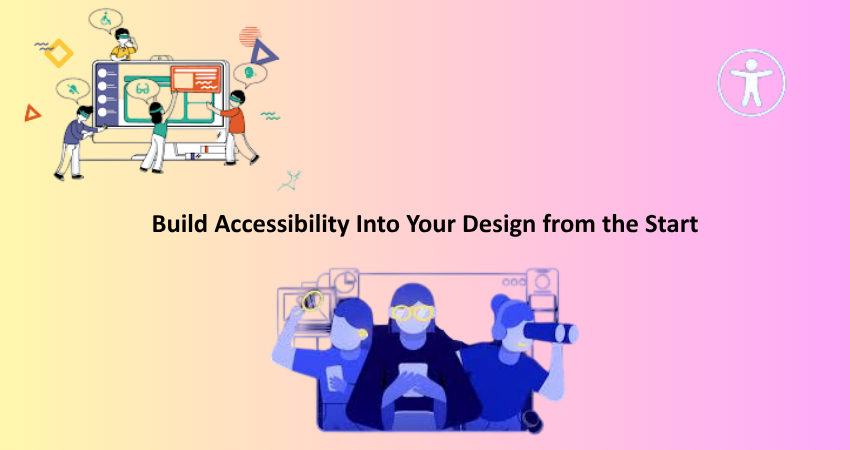
Build Accessibility Into Your Design from the Start
Use Color, Contrast, and Fonts That Work for Everyone
To design products that are truly inclusive, accessibility functions must become an essential requirement rather than being treated as just a “nice-to-have.” Such considerations might initially be sidelined by beginners: for example, design choices pertaining to color, contrast, or typography can influence individuals with visual impairments or cognitive disabilities. If, say, information is solely delivered through color, then for colorblind users, this information is not accessible. Or, adding to this problem, low contrast means text will become unreadable for lots of folks, especially when viewed via mobile devices and in bright light. Which gives further credence to the need to design with accessibility in mind from inception.
Text must be as bright and glaringly contrasting against a background as possible: Use such combinations. On this score, WebAIM’s Contrast Checker will protect from failure in meeting WCAG (Web Content Accessibility Guidelines) standards. Select readable fonts and proper font sizes- definitely not that itty-bitty type size that has users squinting to read it. And keep anything written above small amounts of text in standard capitalization; otherwise, readability takes a big hit. Meanwhile, remember that flashy animations or hover interactions are not good ways to pass on crucial information as users will experience it differently; designing accessibly is good for everyone, not just those with disabilities.
Ensure Your UI Works Well with Keyboards and Screen Readers
Beyond color and typography, understanding accessibility means understanding how users can interact with your interface through different devices or tools. Not everyone uses a mouse—some users may only use keyboards or screen readers to navigate the web. As much as a beginner can make a big difference, it is by ensuring that your UI can be navigated through a keyboard in addition to being correctly labeled with assistive technologies. Examples of this are focus states on form fields, buttons, or links, as well as the use of semantic HTML elements that define structure.
For instance, you need to ensure that users can tab through your form fields in the correct order, and that every actionable element like buttons or dropdowns can be operated without a mouse. Use aria-labels where necessary to help screen readers understand the purpose of different interface elements. While this might seem technical at first, actually, most modern design and development tools come with built-in support or guidelines for making things accessible. The key part is being concerned about it early. Making your UI accessible isn’t just ethical, but the hallmark of professional design that will set you apart from others who are just starting out.
Conclusion
The entire UX/UI design field can seem daunting for anyone looking to dip a toe into it, but it most definitely does not have to be. By holding true to the simple things—such as user needs, clear navigation, and accessibility—even a novice can create an effective digital experience with friendly properties. The strategies given in this article are not just theoretical; they are practical, tried-and-tested methods that work across any kind of digital product.
Great design, unlike people think, is not so much about complexity but about clarity and empathy. Always test your ideas with real users and filter their feedback to improve your work. This way, you will slowly find your own groove, your own design style, and instincts along the way. But the principles laid out here will keep on acting as lighthouses as you proceed. Remember: UX/UI design is a journey, and every screen you put together takes you one step closer to being a master.