
Introduction
User experience(UX) today plays an important role in the success of products and services. It includes the journey where a user interacts with a digital interface-from first entry to when he believes he is a regular. It should be intuitive, efficient, and enjoyable-but all that it really is about is what the user experiences at the time. Aestheticism does not have much to do with it as these involve knowing user behavior, needs, and motivations to find solutions they would want. The seamless introduction of technology into everyday life now highlights the need for continuous and meaningful user experiences.
Principles of good UX design serve as base rules to guide designers in creating user-friendly products. These rules range from user-centered design to simplicity, consistency, and accessibility, ensuring that products meet the highest functional level and are a joy to use. Following these principles, designers can build trust, engagement, and usage with satisfaction. This article deals with these main principles and explains how to apply them to ensure better user experiences.
Understanding the User: Empathy at the Core of UX
User-Centered Design Philosophy
The understanding of user forms the basis of effective UX design, which is user-centered design (UCD) as a philosophy, in which the user occupies the foremost position in the design process. It involves a lot of research to arrive at an understanding of what the user really needs, prefers, and the things hampering them in achieving the end goal to arrive at detailed user personas and scenarios from which they can tailor solutions to solve particular challenges specific to the user. It becomes apparent that whatever end product is going to be like, it is user-centric with a promise of adding real value to users.
In the user-centered design approach, there is an infusion of users into the whole process of user-centered design. The cycles of test and retesting usability feedback allow designers to iterate while basing their solutions on actual user interactions. This really helps to improve usability and user ownership because they will feel like their input has been considered in the end product. Lastly, a user-centric approach leads products to become intuitive and accessible along the lines of achieving user goals.
And, UCD makes much more empathy in that one needs to put oneself really into the user’s shoes and now feel the product through their eyes or at least with some shared viewing. It reveals possible pain points that may not be visible through data analysis alone; hence there is room for improvement. By having that close affinity with the users, designers ensure that whatever solutions they build meet not only the functionality aspect, but also the emotional aspect which would in turn lead to greater user satisfaction and loyalty.
Psychological Principles in UX Design
To create intuitive user experiences, one has to comprehend human behavior. Psychologically speaking, Hick’s Law and Fitts’s Law provide an insight into the manner in which users perceive and act with respect to interfaces. Hick’s Law states that with the increase in the options presented to the user, the time taken to make a decision also increases; therefore, keep your interface simple. Fitts’s Law explains the relationship between the distance to a target and time to reach the target, helping designers make decisions about button size and position.
In addition, notions such as cognitive load and mental models are also fundamental aspects of UX design. Minimizing cognitive load through the removal of unnecessary information and mapping designs onto users’ current mental models improves usability. Through the application of these psychological principles, designers are able to develop interfaces that are intuitive and easy to use. Designing in this manner ensures that the user experience is seamless.
The principles of Gestalt perception may also be adopted to arrange elements in a fashion that is semantically consistent with how users usually perceive groupings and patterns. For example, the proximity law states that elements when close together or near one another are judged to relate to one another and hence can be used to group related functionalities. By applying and understanding these principles of psychology, designers would carry out the much-needed critical thinking and caring touch in synergy with beautiful presentation to produce human-appealing interfaces thereby improving the overall user satisfaction general rating.
Simplicity: The Power of Minimal and Focused Design
Reducing Clutter for Clearer Navigation
It is an old age saying that the simpler the design, the better. It would mean that something should ideally present information simply and plainly; nothing needs to be stripped off from it. However, that is, the stripping off a functional little design is quite different. Cluttered interfaces will prevent users from being able to focus on the most important and basic tasks. By having the content take precedence and removing anything that might distract from it, the designer can lead the user’s attention to the most important functions of an interface. This approach will in turn improve usability and decrease any user errors.
With this clarity in their workings, techniques like whitespace, consistent typography, and intuitive iconography will contribute toward keeping the interface clean and organized. Whitespace prevents clutter by keeping distractions away from different elements of an interface, thereby increasing readability. Maintaining a consistent typography style aids readability and preserves text hierarchy. Iconography that uses familiar symbols contributes to user understanding of functionality without the need for excess text. Each of these aspects adds up to make a clean user-centered design.
More information might be disclosed as time goes on. Simplicity can then be defined as only the necessary information being made available to users at any given time. By this method, users are kept from being inundated with unworthy details, which would otherwise detract them from finishing their tasks. Designers can effectively keep displays clean, revealing detailed information or options based just on the user’s request, thus serving a dual purpose for novice and skilled users.
Visual Hierarchy and Content Prioritization
Visual hierarchy organizes content in such a way as to enable an effective path through an interface. Designers manipulate size, color, contrast, and placement to indicate the importance of elements. For instance, large and bold headings grab attention, while colors that are subdued indicate secondary information. With this arrangement, users can quite easily locate and focus on important information.
Prioritizing content means deciding which information is more important to the users and presenting it in such a way that the users see it as the first thing. One must consider user goals and design the interface according to those goals. Content aligned with what users would look for creates natural channels that help users as they seek to accomplish their tasks. That said, visual hierarchy and content prioritization enhance usability and add to the charm of an interaction.
The use of visual cues such as color emphasis and directional indicators would further establish the hierarchy and attract attention. For example, call-to-action buttons with a color distinct from the primary colors of the application will attract attention and guide the user toward actions we want them to take. Likewise, directional indicators like arrows or flows may take the user by the hand through a logical flow so that they do not miss out on important steps in a process. By following this practice, the designer can achieve a balance between form and function.
Consistency: Creating Predictable and Familiar Experiences
Design Systems and Style Guides
Design consistency breeds familiarity that allows the user to traverse interfaces confidently. Design systems and style guides are the tools to maintain uniformity across the product. A design system is a collection of reusable components or specific rules, e.g., color palette, typography, UI elements, etc. Style guides document the specifics of when and how these should be used to maintain coherence throughout the design.
A design system makes development easier because designers and developers work with approved components. Production is much quicker, but a steady user experience is maintained. Users can, therefore, have predictable interactions supported by fewer learning curves and more satisfaction. Consistency, achieved through design systems and style guides, forms the basis of trust and reliability of any digital product.
A design system would also allow scaling for the design system, so that teams can efficiently expand or update the product while maintaining consistent standards. Further, it establishes a kind of a common language, promoting team collaboration among various cross-functional teams. Investment in design systems and style guides ensures that even when a product changes over time, it will continue to feel like one coherent and user-friendly product.
Behavioral Consistency in User Flows
Behavioral consistency guarantees that similar behaviors produce similar results throughout an interface, thus allowing the user to develop reliable mental models and enhance usability. For example, if clicking a button causes a specific outcome in a particular part of an app, it is reasonable for the user to expect the same in all other places. When unexpected behaviors manifest, these create confusion and hamper usability.
When behavioral consistency is preserved, the standardization of all interactions, including navigational patterns, feedback, and error handling, is preferred. Consistent feedback, such as confirmation messages, and visual cues help reinforce the user’s confidence. Error messages should be consistent so that users can quickly identify an issue and fix it. Behavioral consistency fosters a natural and supportive user experience, which the designer seeks to create.
Applying the principle of least astonishment will further enhance behavioral consistency in the design. A system must operate in a manner that least surprises its user. Designers cooperate with system behavior to align with user expectations to minimize confusion and build trust. Once again, this equalizes good usability and a pleasant seamless experience.
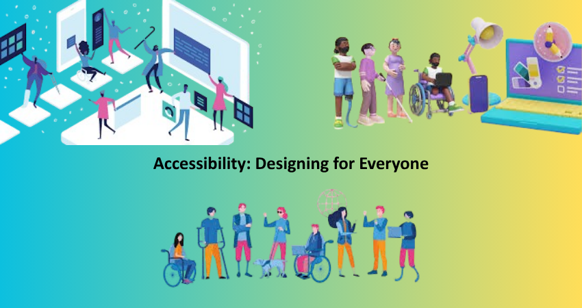
Accessibility: Designing for Everyone
Inclusive Design Principles
Accessibility in UX design provides products to individuals with diverse abilities. Inclusive design practices encourage designing experiences that accommodate diverse needs, including users with disabilities. This involves considering factors such as color contrast for blind users, keyboard navigation for physically disabled users, and screen reader compatibility for blind users. Accessibility is not an add-on but an essential aspect of responsible and ethical design. When you build with accessibility in mind initially, your product is more robust, simpler to use, and more accessible by default.
Designing inclusively is also about considering transitory or situational limitations, such as users in sunlight, users on older hardware, or users with less-than-broadband internet connectivity. If you tune for edge cases, everyone benefits. Providing images with alt text, having the correct heading order, and giving enough time to complete tasks are just a few of the means by which inclusive design will suit a large segment of users. It also reduces irritation and makes it more likely that people will return and tell others about your product.
Other than legal compliance (like WCAG or ADA), accessible design earns you trust and goodwill among your users. It shows that you care about making your product available to all—not only the masses. Inclusive UX design also exposes you to a bigger possible user base and even gives your brand a competitive advantage. Empathy and foresight are called for: consideration for how different users utilize your virtual space breaks down walls and produces lasting interaction.
Universal Usability and Device Compatibility
Universal usability refers to the degree to which a product can be used by the widest possible audience, on any given device and platforms. Consumers today access digital products on mobile phones, tablets, desktops, smart TVs, and even via voice assistants. UX designers must have their interfaces respond suitably across screen sizes and orientations using responsive design principles. This flexibility not only enhances user satisfaction but also has a massive contribution in SEO and performance metrics, which are critical for business outcomes.
A responsive design strategy usually involves fluid grid systems, flexible images, and media queries to adapt the layout to various screen widths. But usability extends beyond layout. Designers should also consider accessibility on various operating systems, browser versions, and hardware capabilities. For instance, a button that’s comfortable to tap on a big desktop monitor can be hard to tap on a small smartphone if not optimally tuned. To prioritize mobile-first design is typically the optimal solution for dealing with a broad universe of devices from the start.
It also includes designing for users on low-bandwidth or older devices. This may involve optimizing loading times of images and scripts, employing fallback fonts, and creating lean interactions that do not consume battery power or call for high processing capacity. These actions reflect respect for all users, whatever their technology conditions. Through dedication to device compatibility and universal accessibility, UX designers facilitate closing digital divides and providing wider reach and inclusion.
Conclusion
Better UX design isn’t something that happens by chance—it’s the outcome of deliberate choices based on principles with a proven track record. From empathizing with users and understanding their needs through psychology to streamlining interfaces for consistency and clarity, every principle of solid UX design is critical for building valuable digital experiences. Accessibility and inclusivity also help make sure no one is left behind, whether based on disability or device. When these principles align, the result is a product that not only works but also feels intuitive, respectful, and even lovely to use.
In an age where user expectations are higher than ever, spending money on UX is no longer a nicety—it’s a competitive imperative. Whether you’re building a straightforward app or a complicated enterprise platform, these principles are your north star. They remind us that users are paramount and that great products are created not for use, but for people. Through empathy, clarity, consistency, and inclusion, UX designers can build digital experiences that really do stand out—providing lasting value not only to businesses, but to each individual who engages with them.